카테고리 없음
react 프로젝트 - 감정일기장 만들기(3) : 공통컴포넌트 구현하기(버튼, 헤더)
babydeve
2023. 8. 10. 14:51
공통컴포넌트를 서비스 개발 도중에 구현하면 의식의 흐름을 방해할 뿐만 아니라 누락하는 컴포넌트가 생길 수 있고, 중복 코드의 발생 위험도 높아진다.
고로 본격적인 서비스 개발 전 여러 페이지에서 공통으로 사용하는 컴포넌트를 먼저 구현한다.
1. Button 컴포넌트 구현하기
1) 3가지 종류의 버튼을 만들 예정이다.
- default : 일반적인 기능 수행 => 회색 계열
- positive : 긍정적인 기능 수행(새 일기 작성, 일기 작성 완료, 수정 완료 등) => 초록색 계열
- negative : 부정적인 기능 수행(일기 삭제) => 붉은색 계열
2)버튼 컴포넌트 기본 구현
- src폴더 아래에 component 폴더 생성
- component 폴더에 Button.js 파일 생성
import "./Button.css";

const Button = ({text, type, onClick}) => {
    return <button className="Button">버튼</button>
}

export default Button;- Home.js에 버튼 기능 구현
- 전달할 props 작성
import { useSearchParams } from "react-router-dom";
import Button from '../component/Button'

const Home = () => {
    const [searchParams, setSearchParams] = useSearchParams();
    console.log(searchParams.get("sort"))

    return (
        <div>
            <Button
                text={"버튼텍스트"}
                onClick={()=>{alert("hi")}}
            />
        </div>
    )
}

export default Home;- 버튼 클래스명을 동적으로 주기
- const btnType = ["positive", "negative"].includes(type) ? type : "default" 버튼타입지정
- <button className={["Button", `Button_${btnType}`].join(" ")} 버튼 클래스명에 동적으로 버튼타입붙여주기
- Button.defaultProps = { type: "default",} 동적으로 변할 버튼의 티폴트props 정해주기
import "./Button.css";

const Button = ({text, type, onClick}) => {
    const btnType = ["positive", "negative"].includes(type) ? type : "default"

    return (
    <button
        className={["Button", `Button_${btnType}`].join(" ")}
        onClick={onClick}
    >
        {text}
    </button>
    )
}
Button.defaultProps = {
    type: "default",
}

export default Button;- 버튼타입을 이용해 CSS 속성 부여하기
.Button {
    cursor : pointer;
    border: none;
    border-radius: 5px;
    padding: 10px 20px;
    font-size: 18px;
    white-space: nowrap;
    font-family: "Nanum Pen Script";
}
.Button_default {
    background-color: #ececec;
    color: black;
}
.Button_positive {
    background-color: #64c964;
    color: white;
}
.Button_negative {
    background-color: #fd565f;
    color: white;
}- props로 전달되는 type에 따라 다른 스타일의 버튼을 렌더링하기
import { useSearchParams } from "react-router-dom";
import Button from '../component/Button'

const Home = () => {
    const [searchParams, setSearchParams] = useSearchParams();

    return (
        <div>
            <Button
                text={"기본 버튼"}
                onClick={()=>{alert("default button")}}
            />
            <Button
                type="positive"
                text={"긍정 버튼"}
                onClick={()=>{alert("positive button")}}
            />
            <Button
                type="negative"
                text={"부정 버튼"}
                onClick={()=>{alert("negative button")}}
            />
        </div>
    )
}

export default Home;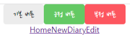
2. Header컴포넌트 구현하기
- 전달받을 props인 title, leftChild, rightChild
- Header.js
import './Header.css';

const Header = ({title, leftChild, rightChild}) => {
    return(
        <div className="Header">
            <div className="header_left">{leftChild}</div>
            <div className="header_title">{title}</div>
            <div className="header_right">{rightChild}</div>
        </div>
    )
}

export default Header;- Header.css
.Header{
    padding-top: 20px;
    padding-bottom: 20px;

    display: flex;
    align-items: center;
    border-bottom: 1px solid #e2e2e2;
}
.Header > div {
    display: flex;
}

.Header button {
    font-family: "Nanum Pen Script";
}

.Header .header_title{
    width: 50%;
    font-size: 25px;
    justify-content: center;
}
.Header .header_left{
    width: 25%;
    justify-content: start;
}
.Header .header_right{
    width: 25%;
    justify-content: end;
}- Home.js
- Header 컴포넌트 안에 전달할 title, leftChild, rightChild props를 설정한다.
import { useSearchParams } from "react-router-dom";
import Button from '../component/Button'
import Header from '../component/Header'

const Home = () => {
    const [searchParams, setSearchParams] = useSearchParams();

    return (
        <div>
            <Header
                title={"Home"}
                leftChild={
                    <Button
                        type="positive"
                        text={"긍정 버튼"}
                        onClick={()=>{alert("positive button")}}
                    />
                }
                rightChild={
                    <Button
                        type="negative"
                        text={"부정 버튼"}
                        onClick={()=>{alert("negative button")}}
                    />

                }
            />
        </div>
    )
}

export default Home;
728x90